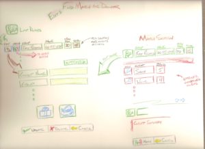
I’ve always favored the trusty pencil and paper when first sketching out all kinds of ideas, and user interfaces are no exception. Visio-type tools come in handy for diagramming architecture and logic, but when visual creativity is needed, the pencil allows you to be much more loose and free-form. I was inspired recently by a video of Adaptive Path as they brainstormed user interfaces for an iPhone application. The designer used colored pencils and the sketches are gorgeous.
I am currently working on a web application for a volunteer organization, so I decided to break out my colored pencils and start sketching. I loved how it felt. The argument from many people will be, “adding color can lead you into too much focus on details when they’re not yet needed.” While that may be true, I wasn’t really thinking about bringing these colors into my final palette. I was just using them to add fun to the process of brainstorming.
