As you may recall from the last post, we’ve done a little brainstorming, and now it’s time to sketch out our ideas for the interface. We don’t want to draw details. The goal here is to just get our brainstorms on paper. 37signals suggests using big writing utensils, like markers, to force yourself away from the details. We should just be sketching boxes and shapes to convey our rough interfaces to someone else.
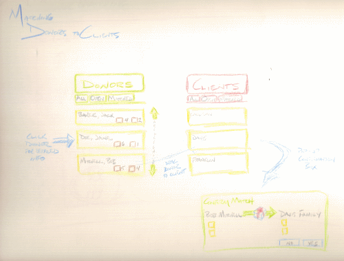
Before I refreshed myself with Getting Real, this is what one of my interface sketches looked like:

Notice how many details I tried to think through here. I tried to plan the exact buttons that would be needed, how a user would navigate through a list, what data would populate a section, and the details of a pop-up box. This was getting way too far ahead of myself. I had the potential of locking myself into an interface before I knew everything I needed. Plus, I used color. I actually wrote another post a while ago where I declared the joy I found in brainstorming with colored pencils. I think that may still have its place, but it should be reserved for further along in this process.
So for this exercise, I stuck to a medium size drawing utensil, and only labeled something in the sketch when it would be hard to remember later what I was actually sketching.
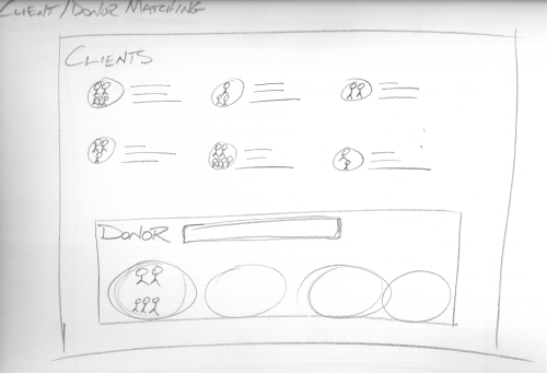
One of the main activities of the charity tree app is to match clients with donors. This first sketch’s intention is to portray a move away from what may be normally thought of in a data matching scenario. The easy, but boring way to implement it would be to have two list boxes, side-by-side, and the user selects data from one box and moves it to the other. Here, I thought of a view of a donor who has openings for more clients. The clients are listed at the top of the screen along with some summary data. The icon for the family is perhaps dragged and dropped into one of the donor’s open spots. This would definitely make the data much more interesting to view and manipulate than dull list boxes or spreadsheet views.

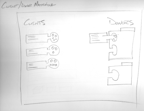
This next sketch explores a slightly different design on making the matches. Here I was thinking about interlocking clients and donors like snapping pieces of a puzzle together.

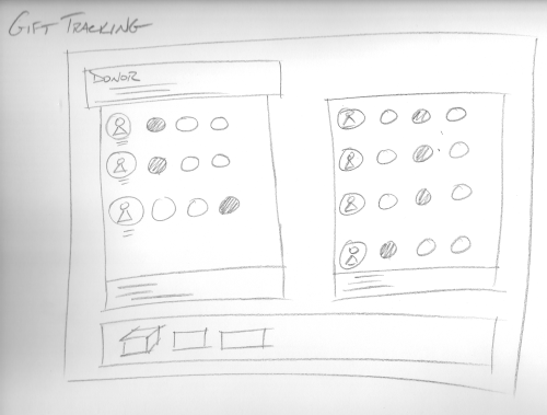
One of the other key tasks the app needs to accommodate is tracking gifts. This sketch shows an idea of looking at a specific donor, along with the clients that have been assigned to the donor, and a visual indication on the status of each gift (e.g. gifting tag sent, gift received, gift delivered). There could be a summary box at the bottom of the page displaying data such as total gifts assigned versus gifts received. Again, the details weren’t thought of too much at this point; I just wanted to portray a fun interface for manipulating the data.

Assuming we are satisfied with these sketches, we can move onto the mockups. But remember! We are not locked into the design at all. This process is about quick design iterations before we commit to the hardcore coding.
Articles in this series: