From the previous post, you can see that I roughed out a couple of ideas for one of the most important tasks of this app: matching clients with donors. I want to revisit this task to determine what it is exactly that will need to be accomplished on this screen. Then we will rough out another interface.
Approaches
There are a few of different ways a user would want to approach the matching activity:
- Call up the clients waiting to be matched and find donors for them
- Call up the donors waiting to be matched and find clients for them
- Call up a specific client or donor and find available matches or remove assigned matches
Items 1 and 2 are just reciprocals. You either want to approach the matches from the clients’ or donors’ sides. Item 3 addresses organizations who are tracking possibly hundreds of clients and donors, who want to quickly locate a specific entity.
Screens Required
After a client or donor has been selected from a list or a search, the next screen would show possibly more detail about the selected entity with a list of possible entities to be matched with. At that point, a match can be made. So our screen list for this activity looks like this:
- Client list
- Donor list
- Search
- Match
Part of the goal of this phase is to answer the following question for each screen: “How do I know when it’s useful?” So for the matching activity, let’s take it one screen at a time.
Client List Screen
At this point, I’ve decided not to put the client and donor lists on the same screen. There is just too much information for both entities to be able to make informed matches from summary displays. (I’m not trying to think of too much detail here, but I know that according to the organization, some donors may specify things like, “I only want to give give gifts to children under 10”, and things like that. Details like those do not lend themselves to summary screens.)
So how will we know when this screen is useful?
- A list of all clients waiting to be matched can be navigated easily
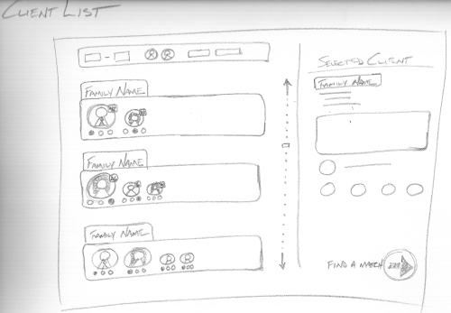
- Enough information for each client is displayed for the user to make a decision on whether to proceed with that particular client. Generally speaking, the user will want to know the genders and ages of waiting clients.
Here is the sketch:

On the left side you can see the list of clients displaying basic information: the family name (since clients are grouped by family as per a typical application), and the gender and age of each individual. Also shown beneath each individual is an indication of their current gift status. Above the list is a filter bar, where the user can set the list to display only certain ages, genders, or other criteria. A scrollbar is also available to the right. So I think this interface could satisfy the two requirements: navigate the list easily and see enough information at a glance to proceed.
The right section of the screen displays detailed information about the selected client before proceeding to find a matching donor.
Donor List Screen
The donor list screen is similar to the client list in layout. However, the summary information displayed for a donor is slightly different. For each donor, described is any specifically requested criteria about who they wish to give to (teenagers, single moms, families of 4 or less, etc.) and how many openings they have left for each type.
So how will we know when this screen is useful?
- A list of donors waiting to be matched can be navigated easily
- Enough information for each donor is displayed for the user to make a decision on whether to proceed with that particular donor. Generally speaking, the user will want to know the types of clients the donor is looking for and how many.
Search Screen
I’m not sure if the search demands its own screen (a nice big and bold search box with some suggestions perhaps) or a search box will simply sit in the right section, at the top of both the client list and donor list screens.
Match Screen
After a client or donor is selected to proceed from one of their respective screens, it is time to match them up. Let’s look at a concept for the screen that would display after we’ve selected a client from the client list screen.
So how will we know when this screen is useful?
- A detailed view of the selected client is available
- A list of available donors is easily navigated
- A detailed view of a donor ready to be matched is available
- A match is able to be made
Here is the sketch:

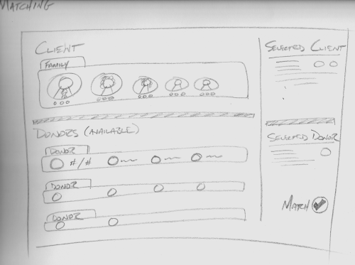
The client is the main focal point of this screen with a view similar to that of the client list screen. Immediately to the right, however, is more information about the client. Below the main client view is a list of available donors. These donors all have openings for the entire client family. (I need to think about allowing the selection of one member of a client family at a time here, but that can wait). Each donor row displays summary information for the donor — mainly stats on what type of client they would like to donate too and how many openings they have left. Immediately to the right of the donors is a detailed view of the highlighted donor. If the user is satisfied with the pairing, the match button is clicked. (I’m also thinking of dragging individual client family members down to the openings in the donor rows to make the match).
So this was more sketching, like the previous post, but I put a little more thought behind it this time. “From Idea to Implementation”, from Getting Real by 37Signals, suggests answering questions like “What does this app need to do?” and “How will we know when it’s useful?” that I tried to address this time around.
Articles in this series:
- Introduction
- What’s the Big Idea?
- From Idea to Implementation – Brainstorm
- From Idea to Implementation – Sketches
- From Idea to Implementation – Sketches – Part 2
- Interface First
- Interface First – Part 2