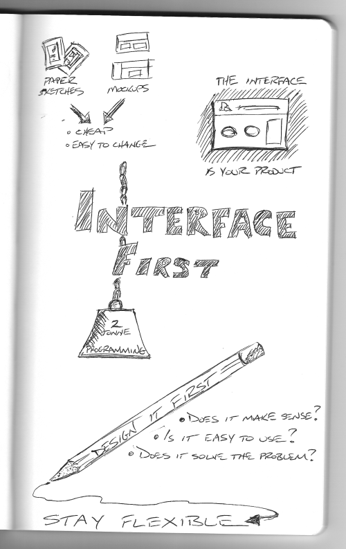
So another new process for me is only thinking about the interface design at the beginning of the project — not how I’m going to code it. Usually, I’d be thinking database schema, class diagrams, coding frameworks, etc. from the get-go. This time however, as throughout this series, I’m using Getting Real from 37Signals as my guide.

If you’ve been following along (and if not, I have a list of articles at the bottom of this post), you’ve watched as I’ve attempted to sketch out ideas for some of the most important screens in this project. This is really quite a refreshing approach and it makes a lot of sense. As Getting Real explains, the interface is what the user sees — it IS your product. We can play around with how the app is going to look and feel right NOW and not just slap it on at the end of the project.
Sketching out interfaces and changing things around to see what feels right is a ton easier than rewriting code. We can sketch, create some loose mockups and repeat as many times as we want for minimal cost.
Articles in this series: