To Framework or Not To Framework

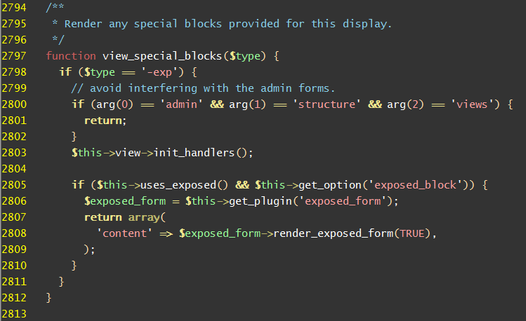
Drupal Views snippet

So this post is really just a mess of thoughts and questions that have been erupting out of my cranium the last few months or so, as I’ve dealt with decisions on using different platforms and technologies for different projects. Unfortunately, I don’t think I’ve come up with any answers yet, but getting this out in print is relieving some of the built up pressure.

I’ve been involved in several website projects recently where the question keeps arising as to whether to use a framework, and if so, which one? The “which one” question can be complicated enough, but I’ve been taking a step back and really trying to decide if I want to use a framework at all!

Now, I’ve been involved in this battle for some time now, and it has intensified with my recent experiences with Drupal projects. I’ve built several sites now in Drupal with varying degrees of success. It’s been a roller coaster. It usually starts with the siren call that sounds like “Hey! You could do just about everything you want in Drupal. Why not plunge all the way in and make this your framework for life!” But in the valleys, I’ve wanted to throw everything away and just write pure PHP or make a living somehow in the deep wilderness. It’s making me second guess myself on choosing the correct tools for the job.

Take for instance one of my recent projects. It’s an ecommerce site of sorts, and as you would expect, the design calls for a listing of products, with filters on the left and sorting on the top — like Amazon.com and most other sites of that nature. It’s being built in Drupal. Easy enough, I say. The versatile Views module can handle that. But guess what? Far into the process I realize that you can’t separate the filter controls from the sort controls. There’s a contrib module out there that is addressing this, but it’s still in development and it’s not working on my site. So I start digging through the Views code, trying to figure out what’s gone wrong and in my mind I’m thinking, “If I was building this site in straight PHP or .NET I could write this in five minutes!”

And there’s the problem rearing its ugly head again. What makes more sense? Building a site from scratch, where you have a handle on all of the mechanics, or using a framework where a lot of the standard site code is already written and feature-rich? The lure of the framework, where a lot of things are already taken care of (user administration, roles and security, page editing, etc.) is very enticing. But what I’ve found is that there are always several features the client wants that the framework doesn’t readily handle. And some of them are shockers (like the filter/sort mentioned above).

Now, I’m a coder, so you say, “Randy, if you can code, then just get in that open source goodness and change the code to do what you want.” I can do that, but if you are working with a large framework (e.g. Drupal) it usually isn’t a matter of just hopping into a file and changing a couple lines of code. The framework is massive, it’s extended with a thousand modules written by a thousand different developers and a lot of it, by necessity and good practice is abstracted quite a bit to handle an unknown number of use cases. So it takes time, sometimes a lot of time, and I’m always facing a deadline.

So it sounds like I’m really trashing Drupal. That is not my intent. I’ve worked on several projects where it was the right tool for the job and for the most part, did most of what the client wanted. If it doesn’t, however, that custom coding can get out of hand. The Drupal API is monstrous and I’ve coded quite a few custom modules with it, as the need arises. Sometimes it’s straightforward, many times it’s not.

Lately, I’ve been leaning more towards using PHP supplemented with code libraries. That way I can write PHP without worrying how to integrate it into some massive code base. Using something like Cake or OpenAvanti gives you MVC and ORM out of the box and you can just start coding and feel the cool breeze on your face. Starting a project this way, you can still hear those sirens beckoning, “We’ve already got user admin and page editing ready to go over here.” But I have to resist. Once over there I get sucked in, and before I know it I wish I was back where I had my hands on the wheel.
Charity Tree – Interface First – Part 2

Charity Tree Dashboard

So I’m working on the Charity Tree project again, which I began chronicling in this post, and am picking up where I left off, with user interface design.

I’ve recently come across a fantastic UI prototyping tool called Indigo Studio and am absolutely loving it. I encourage you to try it out. The screenshots in this post were created with this tool, and there are actually interactions wired up as well that you would see if you were viewing them from within the software.

If you’ve read my previous articles in this series, you will remember that one of my main goals is to keep the interface as simple as possible. Matching donors with clients has always been by sticking point, and I think I’ve finally nailed it. As you will see below, there are no more concepts of combination client/donor screens. You simply pick the entity you want to work with, then go search for a match. I think this approach has really simplified things.

So let’s walk through the current state of the UI prototype and I’ll commentate a little on some of the functionality.

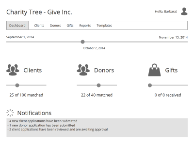
Program Manager’s Dashboard

Program manager's dashboard

This is the screen that the program manager, my term for the overall person in charge of running the charity program, would see after logging in. My goal here is provide an at-a-glance view of the current state of the program.

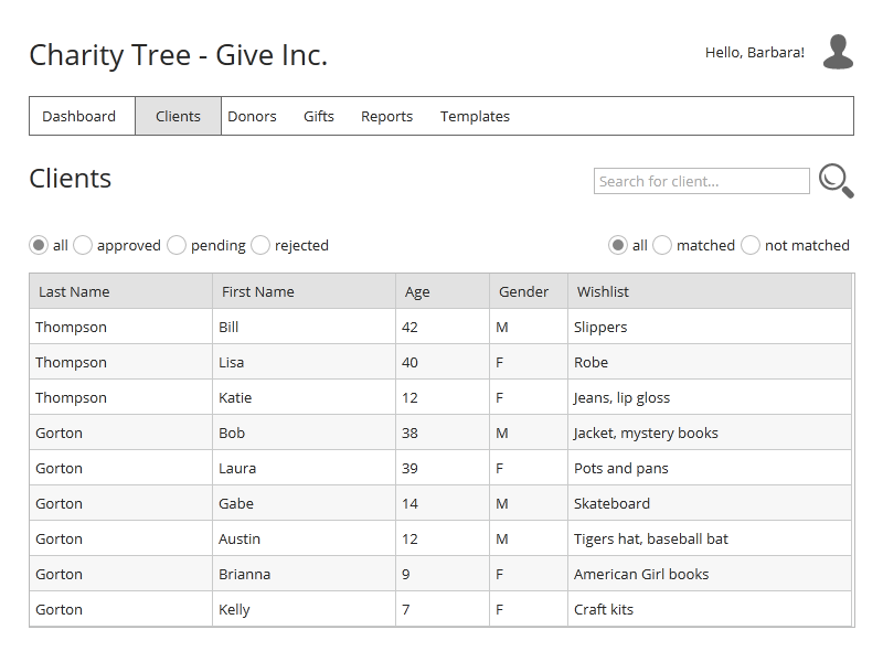
Client Listing

Client Listing

The listing screens are probably the most uninteresting of the lot, but again, I created a screen that allows you to quickly get where you need to go without a billion options. Let’s click one of the “Gorton” rows.

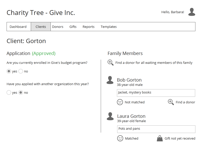
Client Detail

Client Detail

Here we are looking at a client application that has been submitted, including multiple family members. The lower portion of the screen is divided with the general client application data on the left and the family member data on the right. Both sections are scrollable.

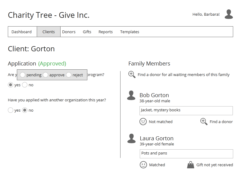
The client application can be reviewed here, and it can be approved or rejected by clicking the status next to Application.

Client application status change

Finding a Donor

Let’s find a donor for this client. You can see on the right-side of the screen that we can find a donor for all of the family members at one time, by clicking “Find a donor for all waiting members of this family”, or find a donor for just one of the family members by clicking “Find a donor” beneath the desired member. Let’s click the “all waiting members” link.

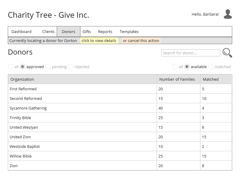
Donors Listing for Match

We are brought to the donor listing screen and notice at the top how the app is now expecting you to locate a donor for the Gorton family. Let’s select the Sycamore Gathering organization. You can see that they would like to donate to 40 families, but only 4 have been assigned so far. Clicking them brings us to the donor detail screen.

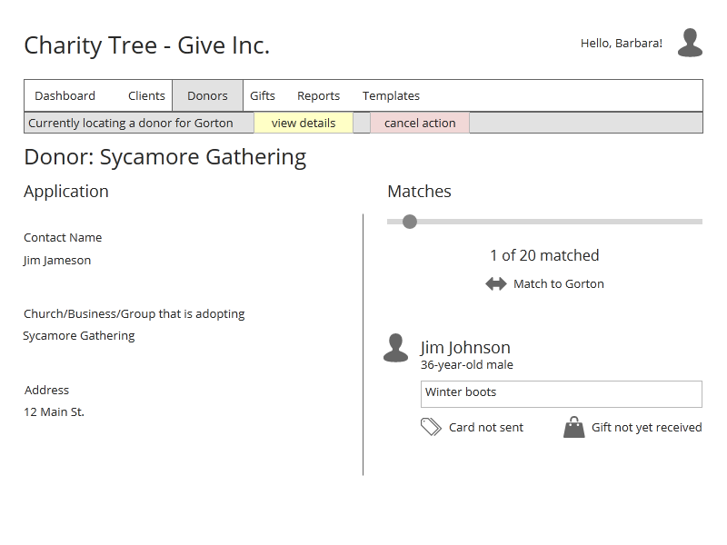
Matching to a donor

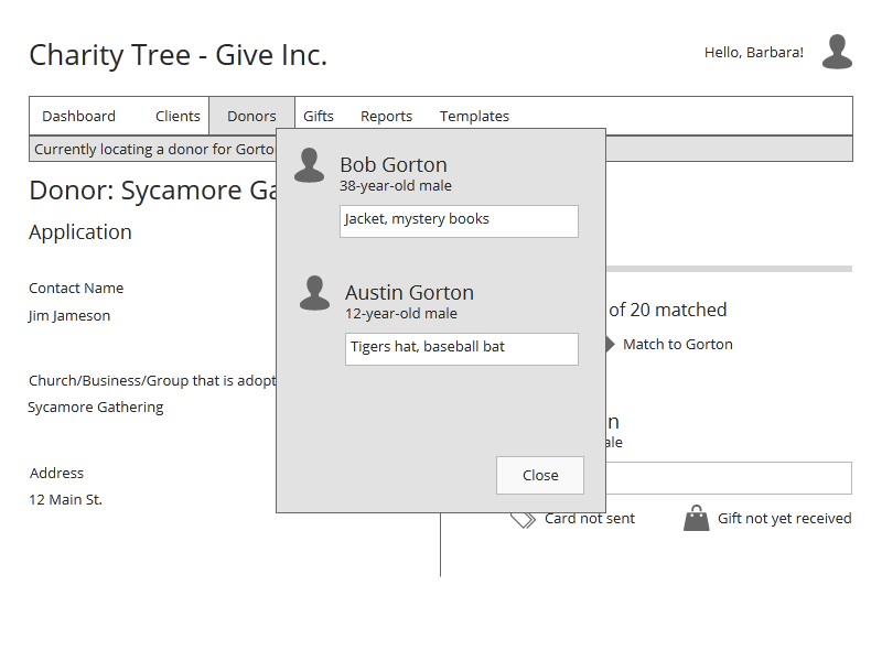
You can see we still have the message at the top of the screen telling us that we are still in “match” mode. Also, on the right side of the screen you can see we have the option of matching the Gorton family to this donor. If we forgot some of the details of the Gorton family, we can click the “view details” link at the top of the page.

View details during match

So let’s say we are satisfied with our selections and make the match by clicking on the “Match to Gorton” link.

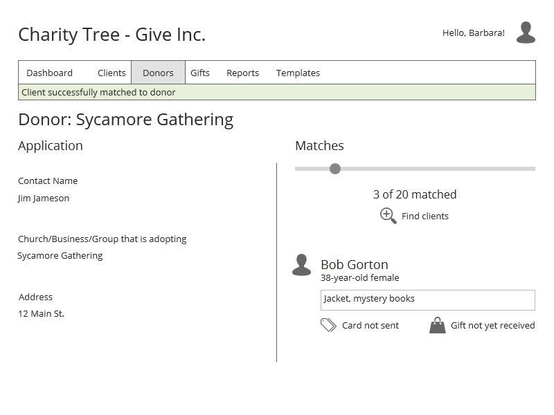
Successful match

Notice the notification of the successful match at the top of the screen and the increase in the match total at the right of the screen.

Conclusion

I’ve detailed out several other button clicks and a few other screen state changes but we’ll stop for now as I think you’ve probably got the idea of how this app is going to work. If you’d like to view all of the screens, you can download the zip file here.

CharityTree UI Mockups

If you have Indigo Studio, you can download my project file and check out all of the screens so far and some of the screen interactions.

CharityTree_IndigoStudio

So I’m pretty excited about the direction this is taking and I’m feeling good about starting to cut some code. More on that later!

Articles in this series:

First Steps with CakePHP

Starting a new, personal project in PHP, I wanted to try out a new framework for the fun of it. After doing a bit of review on many available frameworks, and ruling out the ones I have already used (Zend and OpenAvanti), I settled on CakePHP.

CakePHP
CakePHP

Installation and basic setup were a breeze, and I found the online documentation and tutorials helpful. Very early on, however, as I thought I was still trying to accomplish basic site setup tasks, I began to run into a few road blocks. Luckily, the API documentation is quite thorough and a pleasure to read, so I eventually got through the initial “new framework pains”. In this post, I will walk you through my basic setup and hopefully answer a few questions that may pop up for you after those initial inquiries into the docs.

Here is what I wanted to accomplish (This example isn’t meant to showcase fantastic architecture. It’s just to serve the purpose of making sure I knew how Cake was going to handle things. And believe me, it took several tries):

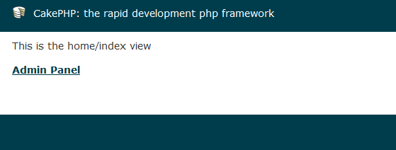
  • Have a public home page with a link to the admin panel
  • The admin panel requires user login

Simple, right? So let’s get started. Note that I’m using CakePHP 2.0.

The first thing we want to do is tell Cake that we intend to use the built-in Authorization Component. I chose to do that in the AppController, so that it is available to all controllers. Copy the default AppController file from the lib/Cake/Controller folder into the app/Controller folder. Within the class declaration, add the following code:

var $components = array('Auth', 'Session');

The $components variable takes an array of components, one of which we’ve specified as Auth.

Next we want the site to use our home controller as the default. Cake comes pre-built to use the pages controller, specified in the app/Config/routes.php file:

	Router::connect('/', array('controller' => 'pages', 'action' => 'display', 'home'));

We are going to change this to:

	Router::connect('/', array('controller' => 'home', 'action' => 'index'));

Now that we are setup to view home/index once we navigate to our site, let’s define the home controller in app/Controller/home_controller.php:

class HomeController extends AppController {
	var $uses = null;

	function beforeFilter() {	
		$this->Auth->allow( 'index' );
	}

	function index() {
	}
}

Since the Auth component is in force for all controllers, we need to tell it to relax for the home/index action. We do this with the beforeFilter() function.

Also note the setting of $uses to null. Controllers usually have this set to the table they will be referencing. In this case, it makes no sense to have a “home” table in the database, so we must tell the controller that we are not going to be using a table.

Now we just need a view to show our admin panel link (located in app/View/home/index.ctp):

<p>This is the home/index view</p>
<p>
	<a href="/admin">Admin Panel</a>	
</p>

If you navigate to your site, you should see the admin panel link.

Home Page
Home Page

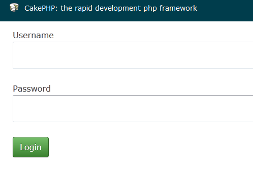
What we want to happen here is for a login screen to display if the anonymous user clicks the admin panel link. We’ve already told Cake that we are using Auth. Now we just have to do a couple of things to hook up a login screen and authenticate a user.

First, Auth is expecting a users controller (app/controller/users_controller.php):

class UsersController extends AppController {
	var $name = 'Users';

	function login() {
		if ($this->request->is('post')) {
			if ($this->Auth->login()) {
				return $this->redirect($this->Auth->redirect());
			}
			else {
				$this->Session->setFlash(__('Username or password is incorrect'), 'default', array(), 'auth');
			}
		}
	}

	function logout() {
		$this->redirect( $this->Auth->logout() );
	}
}

Setup the login view (app/View/users/login.ctp):

 echo $this->Session->flash( 'Auth' ); 
 echo $this->Form->create( 'User' );
 echo $this->Form->input( 'username' );
 echo $this->Form->input( 'password' );
 echo $this->Form->end( 'Login' );

Note: To insert a password into your database that can use for login, use Cake’s built-in AuthComponent::password(‘your_password’) function to determine the hash.

Let’s setup the admin panel. Create the admin controller (app/Controller/admin_controller.php):

class AdminController extends AppController {
	var $uses = null;

	function index() {		
	}
}

And the view (app/View/admin/index.ctp):

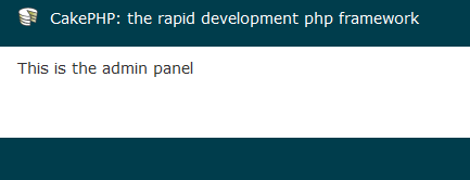
<p>This is the admin panel</p>

Now if you click the admin panel link on the home page, you should be greeted by a login screen.

Login Screen
Login Screen

After a successful login, you should then see the admin panel.

Admin Panel
Admin Panel

So that is how I got a very basic setup running with CakePHP. Check out the great documentation at the official site if you run into trouble, and even start browsing the API. It’s good stuff.

Falling Into the Complexity Trap

So many times I find myself, as a programmer, diving into a problem with an initial thought of a solution that ends up being way too complex. I don’t know if it’s programmers in general or just me, but it seems that as I gain more and more coding knowledge and can take on more and more challenging problems, my brain can fall into a complexity trap. What I mean by that is I now have numerous tools (algorithms, patterns, etc.) at my disposal, and at times I tend to attack a problem with one or more of these tools without stepping back, taking a deep breath, and determining which is the simplest way to get something done.

These solutions usually work, but the code can become messy and hard to maintain versus the simple way that I failed to see at the beginning.

I could probably make this a series of articles, as unfortunately, I tend to do this more than I’d like. But perhaps, writing this down, will force me to think about this issue more and prevent further frustrations.

OK, so now for a real world example. I’ve been recently working on an admin panel for a web app using PHP and Javascript with the Prototype.js library. There is a section of the admin panel where the user can create polls. The user enters a question along with one or more answers and can then re-sort the answers if desired. The re-sorting issue is where I started losing control.

Each answer is stored in an answers table in the database, and to keep it simple, we’ll just define three columns:

  • id
  • answer
  • sort_order

For the UI, the answers look something like this:

Poll Answers
Poll Answers

As you would expect, the up and down arrows allow you to move the answers up and down the list, effectively changing their sort order in the database.

So I immediately started down the road of reacting to the click of an arrow button by determining the current order of answers, swapping the sort orders in the database, getting the new order and manipulating the HTML markup to show the new order. Here’s the code (Note: this is just for moving an answer up the list. I had a separate, similar function for moving an answer down. I hadn’t refactored yet):

function upAnswer(id) {
	//get sort order for this row
	var sortOrder = $('orderAnswer_' + id).innerHTML;

	//if this is the first row, no need to move it up
	if (sortOrder == lowestOrder) {
		return;
	}
	
	//find the row immediately above the selected row
	var idAbove = 0;
	$$('.answerRow').each(function(i) {
		var checkId = i.readAttribute('id').substr(7);

		if ( checkId == id ) {
			throw $break;
		}
		else {
			idAbove = checkId;
		}
	});
	
	// swap the display orders in the database
	new Ajax.Request('/AdminPoll/SwapAnswers/' + id + '/' + idAbove, {
		onSuccess: function(response) {
			
			//store the answer this is going to be moved
			var moveAnswer = $('answer_' + id);
			
			//store both display orders
			var origOrder = $('orderAnswer_' + id).innerHTML;
			var targetOrder = $('orderAnswer_' + idAbove).innerHTML;
			
			//insert the moved answer in the right place
			$('answer_' + idAbove).insert({before:
				'
' + moveAnswer.innerHTML + '
' }); //remove the moved answer moveAnswer.remove(); //swap the display orders on the page $('orderAnswer_' + id).update(targetOrder); $('orderAnswer_' + idAbove).update(origOrder); //hook up the action buttons assignActions(id); }, onFailure: function(response) { alert('Unable to move answer'); } }); }

The code above can be summarized in the following steps:

  1. Determine the sort order for the row just clicked
  2. Since we are in the “move up” function, exit the function if this row is already at the top
  3. Loop through the rows to find the row immediately above this one
  4. We now know the two rows involved in the reordering, so call the database to swap the two sort_order values
  5. Copy the current row and move it to the position above the row just swapped with
  6. Delete the original answer
  7. Since we only moved the markup, call the assignActions function which wires up all of the events to the new input control and buttons

Yikes. Knowing that this was getting ugly, fast, I stepped back and looked at it again. Two key concepts drove the next iteration:

  1. There is no need to maintain the actual sort orders. Just make sure the answers stay in order. For example, if the current order is
    • [answer1 => 5, answer2 => 8, answer3 => 9]

    and we are going to swap the first two answers, the new order does not have to be

    • [answer2 => 5, answer1 => 8, answer3 => 9]

    It can be

    • [answer2 => 1, answer1 => 2, answer3 => 3]
  2. Change thinking from altering the database first then the markup. Instead, swap the two rows in markup, determine what happened, then send the new order to the database.

Here’s the new code:

function moveAnswer(id, moveUp) {
	//get the answer element that is going to be moved
	var answerSource = $('answer_' + id);
	
	//get the current order of the list
	var answerOrder = new Array();
	var iCounter = 0;
	$$('.answerRow').each(function(i) {
		answerOrder[iCounter++] = i.readAttribute('id').substr(i.readAttribute('id').indexOf('_') + 1);
	});
	
	if (moveUp) {
		//make sure that the answer the user wants moved isn't already at the top of the list
		if (id == answerOrder[0]) {
			return;
		}
		else {
			//get the element above the source element
			var answerTarget = $('answer_' + id).previous();
			answerTarget.insert({
				before: answerSource
			});
		}
	}
	//move down
	else {
		if (id == answerOrder[answerOrder.length - 1]) {
			return;
		}
		else {
			//get the element below the source element
			var answerTarget = $('answer_' + id).next();
			
			answerTarget.insert({
				after: answerSource
			});
		}
	}
	
	resortAnswers();
}

function resortAnswers() {
	//get the order of the answer ids
	var answerOrder = new Array();
	
	$$('.answerRow').each(function(i) {
		if (i.readAttribute('id') != null) {
			answerOrder.push(i.readAttribute('id').substr(i.readAttribute('id').indexOf('_') + 1));
		}
	});
	
	if (answerOrder.length > 1) {
		new Ajax.Request('/AdminPoll/SortAnswers/' + answerOrder.join(), {
			onSuccess: function(response) {
			},
			onFailure: function(response) {
				alert('Unable to sort answers');
			}
		});
	}
}

First, note that this function handles moves both up and down by passing in a boolean. Here is a summary of the new code:

  1. Get the answer that’s going to be moved
  2. Get the current order of answers
  3. If the answer is not at the end of the list already, insert it before or after the answer next to it, depending on which way we are moving
  4. Call the database to store the new order

Ahhh, this feels so much better. As you may have noticed, the new code really isn’t any smaller (although there’s still improvement to be made), but it is much cleaner and handles the resorting more efficiently.

A couple of key indicators that I’m about to fall into the complexity trap and should stop me in my tracks are:

  • The code is getting ugly
  • The nagging feeling that there’s probably a function out there to handle something I’m trying to work out (in this case, Prototype’s next() and previous() functions)

It felt good to get back in there and clean up that code. But if I can be more aware of the warning signs, maybe I can do it right in the first place.

How To Write a Simple Facebook Share App

facebook developer
Developing Apps for Facebook

Can I Just Cut Some Code Already?

All I wanted to do was to let users share a video link from a web app I was building. I thought it would be easy. And you know what, it probably is. It’s probably easier than what I’m going to show you here. But is it simply stated somewhere in Facebook’s documentation? Not that I could find. So piecing together parts of their docs, plowing through search after search and reading a multitude of blog posts, I came up with this solution.

Quick Overview

The idea is a simple one. The web app let’s you choose a video and view it within the site. If the “share this” button is clicked, the familiar Facebook dialog will popup, letting the user add an additional message to the built-in metadata for the share. If the user has not yet logged into Facebook, they will be prompted to do so. OK, here we go.

Set Up a Facebook App

I thought that you could simply call a Facebook url with some extra information and you were all set, but all of the examples I saw included an application id as part of the call. So I needed to setup an app. For those of you that haven’t done this before, here is a quick summary.

Search for the Developer App in the search bar and install it to your Facebook account.

Add the Developer App

After you install, you will be presented with a page that allows you to configure the app. There are a lot of settings here, and many of them pertain to applications with a lot more complexity. For our purposes, we are really interested in only a few things. Fill out the basic info as desired (such as website, support email, etc.) and add a logo to spruce up the share dialog box. You will notice on the main settings page that an application id is presented for you. You need that for your share code.

One other note is that apps can have sandbox mode enabled. When in sandbox mode, only you, as the developer, can use the app. This is of course useful for testing. Don’t forget to disable the sandbox when you are ready to go live.

Sandbox Mode
Sandbox Mode

Writing the Code

OK, now let’s get down to it. Like I mentioned, this is quick.

$('#shareFacebook').click(function(event) {
 window.open(FB_FEED_DIALOG_URL +
 'app_id=' + FB_APP_ID +
 '&redirect_uri=' + FB_LINK_DOMAIN +
 '&name=' + FB_TITLE_PREFIX + data.title +
 '&caption=' + data.title +
 '&description=' + data.description +
 '&source=' + FB_YOUTUBE_SOURCE_PREFIX + data.videoId +
 '&link=' + FB_YOUTUBE_LINK_PREFIX + data.videoId +
 '&picture=' + FB_YOUTUBE_PICTURE_PREFIX + data.videoId + FB_YOUTUBE_PICTURE_SUFFIX
 );
});

I have the call to Facebook wrapped inside a jQuery click event which opens a new window. The heart of it is the URL inside of window.open().

  • The call starts out with FB_FEED_DIALOG_URL which is set to ‘http://www.facebook.com/dialog/feed?’.
  • Set your application id which you obtained earlier.
  • Add the URL that you want Facebook to redirect the user to after they’ve shared the link. Note that Facebook will append a ‘/?postId=xxxx’ to the URL so be prepared to handle that. I simply ignored it by telling our routing rules to trim off the question mark and everything after before handing it to the dispatcher.
  • The name, caption, description, source, link and picture will show up in the share dialog box.

As you may have noticed, I’m sharing a YouTube video. That also brought it’s own challenges on how to set these parameters correctly. I believe I obtained these settings from a blog somewhere, which I can’t remember (thank you to the author):

  • FB_YOUTUBE_SOURCE_PREFIX = ‘http://www.youtube.com/v/’
  • FB_YOUTUBE_LINK_PREFIX = ‘http://www.youtube.com/watch?v=’
  • FB_YOUTUBE_PICTURE_PREFIX = ‘img.youtube.com/vi/’

The YouTube video id is appended to each of the above constants.

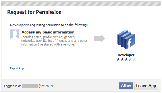
The dialog looks like this:

Facebook Share Dialog

After the user clicks the Publish button, the link is posted to their wall and they are redirected to the URL you specified.

Conclusion

I really hope this helps some of you out there as I could not figure out why something seemingly so simple was taking me forever to figure out. Also, I’m sure there are a lot of alternatives to this method — some much simpler I’m afraid. I’d be interested in hearing your solutions.

Startup Weekend – Interface First

My last several posts have been following a personal project of mine, named Charity Tree, and how I am attempting to follow many of the guidelines laid out in Getting Real by 37Signals. This month I had the privilege to attend West Michigan Startup Weekend and was able to put a few of those gems of wisdom to practice, out in the field, as it were.

After the initial teams were formed on Friday night, we had time to get familiar with the project, the team members and the goals for the weekend. For my particular team, we had initially thought that we would be designing a website/web app over the weekend. So early Saturday morning, when we really got down to  business, I started thinking about the coding that was going to be needed: database backend, form controls, web service functions, etc. I started asking the team some basic questions about how things would work, started to feel a bit overwhelmed, and then said to myself, “Wait! Haven’t I learned anything? I’m diving into details way too quickly”.

I guess in the excitement, and the knowledge of the impending Sunday deadline, I wanted to start cutting code immediately. But where would that have gotten us? As I look back on the results of the weekend, we wouldn’t have gotten far. At the most, we would have had some functioning code that would now have to be abandoned due to changing ideas and requirements realized.

Luckily, I remembered what I had been blogging about for the past couple of weeks, and decided to put it into practice. So one of the first things I did was follow Getting Real’s Interface First concept (I blogged about it recently). Basically, I needed to start sketching out interfaces, rough-like, to start feeling out how the web app was going to work.

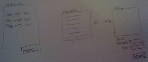
The team started to brainstorm again about how they envisioned different scenarios taking place. I wrote user stories to encapsulate these scenarios. We came up with several wireframes. One is pictured here:

Wireframe
Wireframe

Now, this wireframe may not look like much, but it was interface sketches like these that really made us start to think about how the application pieces as a whole fit together, and more importantly, how processes (both business and application) were going to be carried out.

These rough sketches brought many things to light and really helped us flesh out the project. What did we have by the end of the weekend? Wireframes and mockups. It would have been nice to have some functioning code, but we would have been way off base and throwing away a lot of work. Thinking “Interface First” saved us from going down the wrong road and helped the team narrow in on what was important. The weekend was over, but now we could hit the ground running.

Charity Tree – Interface First

So another new process for me is only thinking about the interface design at the beginning of the project — not how I’m going to code it. Usually, I’d be thinking database schema, class diagrams, coding frameworks, etc. from the get-go. This time however, as throughout this series, I’m using Getting Real from 37Signals as my guide.

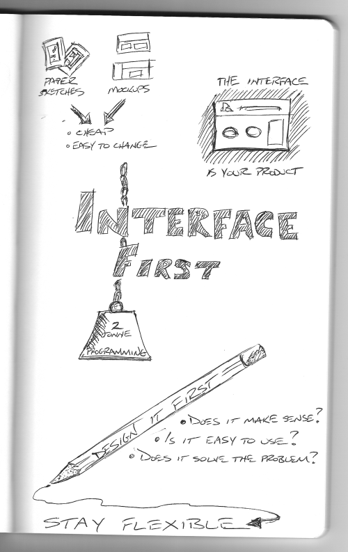
Interface First
Interface First

If you’ve been following along (and if not, I have a list of articles at the bottom of this post), you’ve watched as I’ve attempted to sketch out ideas for some of the most important screens in this project. This is really quite a refreshing approach and it makes a lot of sense. As Getting Real explains, the interface is what the user sees — it IS your product. We can play around with how the app is going to look and feel right NOW and not just slap it on at the end of the project.

Sketching out interfaces and changing things around to see what feels right is a ton easier than rewriting code. We can sketch, create some loose mockups and repeat as many times as we want for minimal cost.

Articles in this series:

Charity Tree – From Idea to Implementation: Sketches – Part 2

From the previous post, you can see that I roughed out a couple of ideas for one of the most important tasks of this app: matching clients with donors. I want to revisit this task to determine what it is exactly that will need to be accomplished on this screen. Then we will rough out another interface.

Approaches

There are a few of different ways a user would want to approach the matching activity:

  1. Call up the clients waiting to be matched and find donors for them
  2. Call up the donors waiting to be matched and find clients for them
  3. Call up a specific client or donor and find available matches or remove assigned matches

Items 1 and 2 are just reciprocals. You either want to approach the matches from the clients’ or donors’ sides. Item 3 addresses organizations who are tracking possibly hundreds of clients and donors, who want to quickly locate a specific entity.

Screens Required

After a client or donor has been selected from a list or a search, the next screen would show possibly more detail about the selected entity with a list of possible entities to be matched with. At that point, a match can be made. So our screen list for this activity looks like this:

  1. Client list
  2. Donor list
  3. Search
  4. Match

Part of the goal of this phase is to answer the following question for each screen: “How do I know when it’s useful?” So for the matching activity, let’s take it one screen at a time.

Client List Screen

At this point, I’ve decided not to put the client and donor lists on the same screen. There is just too much information for both entities to be able to make informed matches from summary displays. (I’m not trying to think of too much detail here, but I know that according to the organization, some donors may specify things like, “I only want to give give gifts to children under 10”, and things like that. Details like those do not lend themselves to summary screens.)

So how will we know when this screen is useful?

  1. A list of all clients waiting to be matched can be navigated easily
  2. Enough information for each client is displayed for the user to make a decision on whether to proceed with that particular client. Generally speaking, the user will want to know the genders and ages of waiting clients.

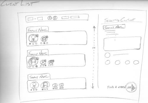
Here is the sketch:

Interface concept for client list screen

On the left side you can see the list of clients displaying basic information: the family name (since clients are grouped by family as per a typical application), and the gender and age of each individual. Also shown beneath each individual is an indication of their current gift status. Above the list is a filter bar, where the user can set the list to display only certain ages, genders, or other criteria. A scrollbar is also available to the right. So I think this interface could satisfy the two requirements: navigate the list easily and see enough information at a glance to proceed.

The right section of the screen displays detailed information about the selected client before proceeding to find a matching donor.

Donor List Screen

The donor list screen is similar to the client list in layout. However, the summary information displayed for a donor is slightly different. For each donor, described is any specifically requested criteria about who they wish to give to (teenagers, single moms, families of 4 or less, etc.) and how many openings they have left for each type.

So how will we know when this screen is useful?

  1. A list of donors waiting to be matched can be navigated easily
  2. Enough information for each donor is displayed for the user to make a decision on whether to proceed with that particular donor. Generally speaking, the user will want to know the types of clients the donor is looking for and how many.

Search Screen

I’m not sure if the search demands its own screen (a nice big and bold search box with some suggestions perhaps) or a search box will simply sit in the right section, at the top of both the client list and donor list screens.

Match Screen

After a client or donor is selected to proceed from one of their respective screens, it is time to match them up. Let’s look at a concept for the screen that would display after we’ve selected a client from the client list screen.

So how will we know when this screen is useful?

  1. A detailed view of the selected client is available
  2. A list of available donors is easily navigated
  3. A detailed view of a donor ready to be matched is available
  4. A match is able to be made

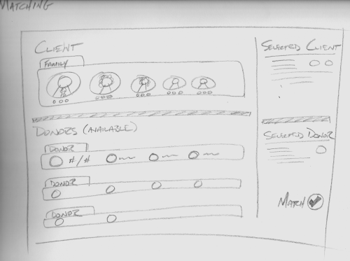
Here is the sketch:

Interface concept for a matching screen

The client is the main focal point of this screen with a view similar to that of the client list screen. Immediately to the right, however, is more information about the client. Below the main client view is a list of available donors. These donors all have openings for the entire client family. (I need to think about allowing the selection of one member of a client family at a time here, but that can wait). Each donor row displays summary information for the donor — mainly stats on what type of client they would like to donate too and how many openings they have left. Immediately to the right of the donors is a detailed view of the highlighted donor. If the user is satisfied with the pairing, the match button is clicked. (I’m also thinking of dragging individual client family members down to the openings in the donor rows to make the match).

So this was more sketching, like the previous post, but I put a little more thought behind it this time. “From Idea to Implementation”, from Getting Real by 37Signals, suggests answering questions like “What does this app need to do?” and “How will we know when it’s useful?” that I tried to address this time around.

Articles in this series:

Charity Tree – From Idea to Implementation: Sketches

As you may recall from the last post, we’ve done a little brainstorming, and now it’s time to sketch out our ideas for the interface. We don’t want to draw details. The goal here is to just get our brainstorms on paper. 37signals suggests using big writing utensils, like markers, to force yourself away from the details. We should just be sketching boxes and shapes to convey our rough interfaces to someone else.

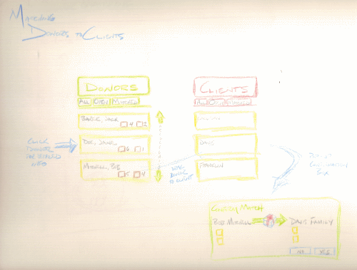
Before I refreshed myself with Getting Real, this is what one of my interface sketches looked like:

The wrong way to roughly sketch an interface

Notice how many details I tried to think through here. I tried to plan the exact buttons that would be needed, how a user would navigate through a list, what data would populate a section, and the details of a pop-up box. This was getting way too far ahead of myself. I had the potential of locking myself into an interface before I knew everything I needed. Plus, I used color. I actually wrote another post a while ago where I declared the joy I found in brainstorming with colored pencils. I think that may still have its place, but it should be reserved for further along in this process.

So for this exercise, I stuck to a medium size drawing utensil, and only labeled something in the sketch when it would be hard to remember later what I was actually sketching.

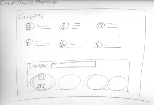
One of the main activities of the charity tree app is to match clients with donors. This first sketch’s intention is to portray a move away from what may be normally thought of in a data matching scenario. The easy, but boring way to implement it would be to have two list boxes, side-by-side, and the user selects data from one box and moves it to the other. Here, I thought of a view of a donor who has openings for more clients. The clients are listed at the top of the screen along with some summary data. The icon for the family is perhaps dragged and dropped into one of the donor’s open spots. This would definitely make the data much more interesting to view and manipulate than dull list boxes or spreadsheet views.

Interface concept for matching clients with donors - idea 1
First interface concept for matching clients with donors

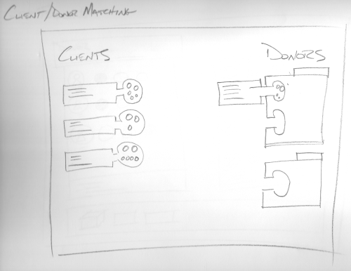
This next sketch explores a slightly different design on making the matches. Here I was thinking about interlocking clients and donors like snapping pieces of a puzzle together.

Interface concept for matching clients with donors - idea 2
Another idea on matching clients with donors

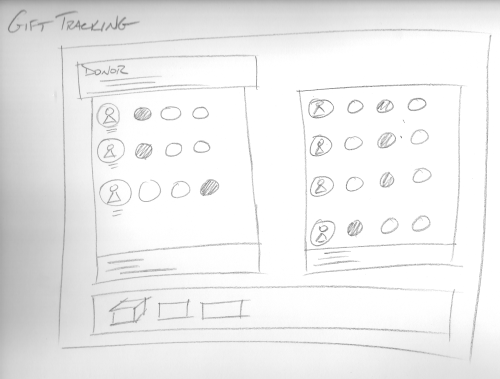
One of the other key tasks the app needs to accommodate is tracking gifts. This sketch shows an idea of looking at a specific donor, along with the clients that have been assigned to the donor, and a visual indication on the status of each gift (e.g. gifting tag sent, gift received, gift delivered). There could be a summary box at the bottom of the page displaying data such as total gifts assigned versus gifts received. Again, the details weren’t thought of too much at this point; I just wanted to portray a fun interface for manipulating the data.

Interface concept for tracking gifts
Concept for tracking gifts

Assuming we are satisfied with these sketches, we can move onto the mockups. But remember! We are not locked into the design at all. This process is about quick design iterations before we commit to the hardcore coding.

Articles in this series:

Charity Tree – From Idea to Implementation: Brainstorm

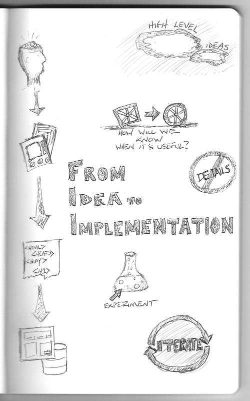
Continuing on with fleshing out my idea, we are going to look at “From Idea to Implementation” from Getting Real. This process will span several posts as we brainstorm, sketch, mockup and code.

From Idea to Implementation

Brainstorm

Brainstorming is about ignoring the details and looking at the product from a bird’s eye view. Let’s just think about what the app is going to do at a high level. Too many times we can get wrapped up in things like, “How am I going to accomplish this part?” and “Do I know how to do what I’m thinking?” Forget about that and just focus on the end user experience.

Here is what this app going to do:

  1. Accept applications from clients and donors
  2. Match clients with donors
  3. Create and send gifting cards
  4. Track gifts

I have more ideas and more details, but they can wait. If the app doesn’t accomplish these four things, it will not be useful. We will be using this list along with the points made in “What’s the Big Idea?” to make sure we stay on track.

Articles in this series: